
Floating cart icon
Add a persistent floating button that opens Llama Cart and shows a live item count — with style, position, color, and device controls.
The floating cart icon is a small button that stays pinned to a corner of your storefront on every page. Shoppers tap it to open the Llama Cart drawer, and a badge on it shows the live number of items in the cart. It's a reliable, theme-independent way to give shoppers a cart trigger that always opens your drawer.
This guide covers every setting on the Floating icon tab, where to find them, and the edge cases to watch for. To style the drawer that the icon opens, see Llama Cart features.
What the floating cart icon is
The floating cart icon is a button that "floats" over your storefront — it stays fixed in a corner of the screen as the shopper scrolls and as they move between pages. It does two things:
- Opens the Llama Cart drawer when clicked, from anywhere on your store.
- Shows a live item count in a small badge, so shoppers always see how many items are in their cart.
The icon renders outside the drawer and is persistent across pages. It always opens the Llama Cart drawer — regardless of how your theme's own cart link is wired.
The floating cart icon is off by default. You have to turn it on for shoppers to see it. It's especially useful when your theme's own cart button isn't reliably connected to the Llama Cart drawer — the floating icon gives you a trigger you fully control.
You don't have to choose one or the other: the floating icon does not replace your theme's cart link. It appears alongside it. Keep both if you like, or hide the theme's cart link in your theme editor if you'd rather shoppers use only the floating icon.
Turn it on and find the settings
Open the Llama Cart customizer
In the app admin, open the Llama Cart customizer (the same place you style the drawer).
Go to the Floating icon tab
Select the Floating icon tab. You'll see a panel titled "Configure floating button for triggering Llama Cart."
Enable the icon
Turn on the floating icon so it shows on your storefront. It's off until you do this.
Style and position it, then save
Pick the icon shape, colors, position, size, and device targeting using the controls below. Watch the live preview, then save and publish your changes.
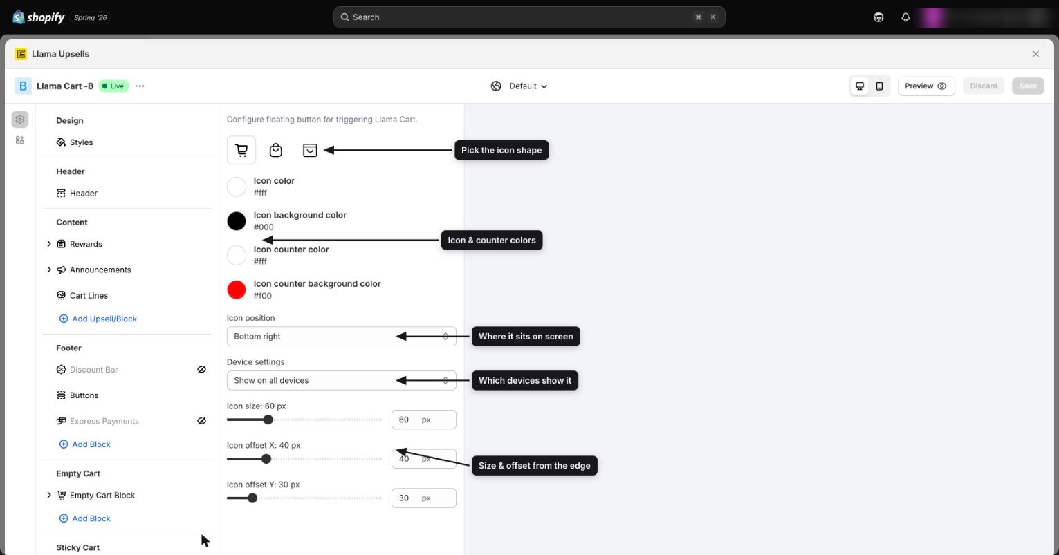
Choose an icon style
Three icon shapes are available. Click the one you want at the top of the tab:
| Shape | What it looks like |
|---|---|
| Cart (default) | A filled shopping-cart icon |
| Bag | An outlined shopping-bag icon with a handle |
| Square bag | An outlined square/tote bag icon |
The default shape is Cart. The shape you pick is drawn in your chosen icon color (see Colors).
Target devices
Use the Show on dropdown to control where the icon appears:
| Option | Behavior |
|---|---|
| Show on all devices (default) | The icon appears on both mobile and desktop |
| Show only on mobile | The icon appears on mobile screens only |
| Show only on desktop | The icon appears on desktop screens only |
Device targeting is the main tool for avoiding clashes with other on-screen widgets (chat bubbles, back-to-top buttons), since those often sit in different places on mobile versus desktop. See Edge cases.
Position and offset
Four controls place the icon precisely in a corner of the screen.
Offsets and size are adjusted in fixed steps of 5 px on each slider, so you can dial in placement without typing exact values.
| Setting | What it does | Range | Default |
|---|---|---|---|
| Position | The corner the icon is pinned to | Bottom right, Bottom left, Top right, Top left | Bottom right |
| Horizontal offset | Distance from the left or right edge (which edge depends on the position you chose) | 15–120 px | 40 px |
| Vertical offset | Distance from the top or bottom edge (which edge depends on the position you chose) | 15–120 px | 30 px |
| Size | The width and height of the button (it's a square) | 40–120 px | 60 px |
The Position dropdown decides which two edges the offsets are measured from. For example, with Bottom right the horizontal offset is the gap from the right edge and the vertical offset is the gap from the bottom edge; with Top left they're measured from the left and top edges instead.
The count badge scales with the button size — its diameter and the count text grow proportionally as you increase Size. So a larger button gets a larger, more legible badge automatically; you don't size the badge separately.
Colors
Four color pickers control the icon and its count badge. Each has a sensible default you can reset to.
| Setting | What it colors | Default |
|---|---|---|
| Icon color | The cart/bag symbol itself | White (#fff) |
| Background color | The round button behind the icon | Black (#000) |
| Count badge text color | The number on the badge | White (#fff) |
| Count badge background | The badge circle behind the number | Red (#f00) |
The defaults give you a black button with a white icon and a red badge with a white number — a high-contrast combination that reads clearly on most stores. Adjust them to match your brand, but keep the icon color and background color contrasting, and the badge text and badge background contrasting, so both stay legible.
How the count stays in sync
You don't have to do anything to keep the badge accurate — it updates itself.
- Whenever the cart changes (an item added, removed, or its quantity changed), Llama Cart broadcasts a cart-updated event (
upsell:cart-updated). The floating icon listens for that event and immediately updates the badge to the new item count. - When a shopper clicks the floating icon, it sends the drawer-toggle signal that opens the Llama Cart drawer. If you're writing custom theme code, you can trigger the same behavior yourself: the drawer also listens for the
lcu:cart:toggleevent, so dispatching it toggles the drawer open or closed.
Because the icon lives outside the drawer and is persistent across pages, the badge stays correct as shoppers browse — the count reflects whatever is currently in the cart, everywhere on your store.
Example recipes
Goal: a bag icon on mobile only, tucked into the bottom-left so it doesn't collide with a desktop chat widget.
- Icon style: Bag
- Show on: Show only on mobile
- Position: Bottom left
- Horizontal offset / Vertical offset: start at the defaults (40 px / 30 px) and nudge up if it overlaps a mobile sticky bar
Because the chat widget lives on desktop, restricting the icon to mobile sidesteps the overlap entirely — and bottom-left keeps it clear of mobile "back to top" controls that often sit bottom-right.
Goal: a button that matches your brand with a count badge that still pops.
- Background color: your brand color
- Icon color: a light or dark shade that contrasts with the background
- Count badge background: a contrasting accent color (the default red works on most brand colors)
- Count badge text color: white or black, whichever reads on the badge background
Keep the badge a different color from the button so the count stays easy to spot at a glance.
Goal: keep the icon out of the way on themes that have a bottom toolbar (sticky add-to-cart bar, mobile nav, cookie banner).
- Position: Top right
- Vertical offset: increase if your theme has a fixed header the icon would sit under
Moving the icon to the top frees up the bottom of the screen for the theme's own controls, so nothing overlaps.
Edge cases and troubleshooting
The icon overlaps a chat bubble, back-to-top button, or sticky bar. Many themes and apps place their own floating widgets in the bottom-right corner — the same default spot as the floating cart icon. To separate them, change the Position to a different corner, increase the Horizontal or Vertical offset, or use Show on to confine the icon to the device where the conflict doesn't exist.
A very large size crowds small screens. The button can be up to 120 px. On mobile, a large button (and its proportionally larger count badge) can cover content or other controls. If you set a big size, prefer a corner with empty space and consider Show only on desktop for the largest sizes — or keep mobile smaller.
Where to go next
Widget customizer reference (all settings & limits)
A field-by-field reference for the per-campaign widget customizer — every setting, its default, and its exact limits for Product Recommendations and Gift with Purchase.
AI product recommendations
Set up an AI-powered Product Recommendation campaign that suggests related products inside your Llama Cart.