
Empty cart state
Configure what the Llama Cart drawer shows when the cart is empty — a message, recommended collections, custom HTML, and per-shopper merchandising.
When a shopper opens the Llama Cart with nothing in it, the drawer doesn't have to look like a dead end. The Empty Cart Block lets you replace an empty cart with a friendly message, one or more recommended product collections, and a clear call to action that sends shoppers back to browsing. This page covers every setting on the Empty state tab, the recipes merchants use most, and the edge cases worth knowing before you publish.
You'll find these controls in the Customizer page under the Empty Cart Block tab.
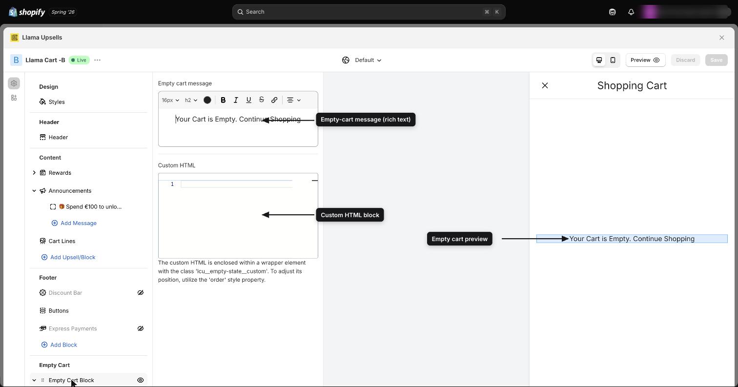
What the empty state is
The empty state is a self-contained section of the drawer that renders only when the cart has zero items. As soon as a shopper adds a product, the empty state disappears and the normal cart (lines, rewards, upsells, footer) takes over.
It is made of up to three layered pieces, in this order by default:
- An empty-cart message (rich text).
- One or more recommended collections (a product slider or a list of category links).
- Optional custom HTML for fully branded content.
| Setting | What it controls | Default |
|---|---|---|
Empty Cart visible (emptyCartStateVisible) | Whether the empty state shows at all | On (visible) |
Empty Cart order (emptyCartStateOrder) | Where the empty state sits relative to other drawer blocks | 0 (top) |
Because Empty Cart visible is on by default, every store starts with an empty state already in place. If you ever want a bare empty cart, turn this off — you don't need to delete your message or collections to hide them.
Empty-cart message
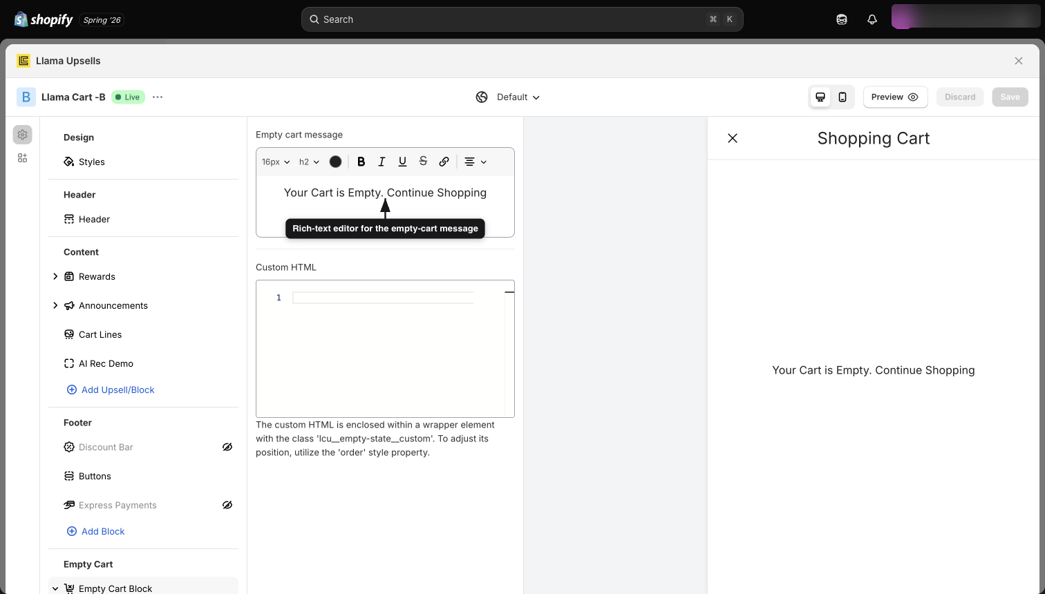
The Empty cart message (emptyCartMessage) is the headline shoppers see first. It's a rich-text field, so you can bold text, change alignment, add links, and adjust size from the editor toolbar.
- Default text: "Your Cart is Empty. Continue Shopping", centered.
- Color: the message inherits your cart's Primary color (text color) automatically, so it stays on-brand even if you restyle the drawer later. You don't set a separate color here.
Keep it short and action-oriented. A single line plus a nudge to keep shopping converts better than a paragraph.
Empty-cart custom HTML
The Custom HTML field (emptyCartCustomHTML) lets you drop in raw HTML — a hero image, a promo banner, a newsletter form, anything your theme supports. Use it when the rich-text message isn't enough.
A few rules to keep in mind:
- Your markup is wrapped in an element with the class
lcu__empty-state__custom. - To control where the custom HTML appears relative to the message and collections, target that wrapper in your custom CSS and set the
orderproperty. Lower numbers move it up. - The field is empty by default, so nothing renders until you add markup.
<div style="text-align:center; padding:16px;">
  <img src="https://cdn.example.com/empty-cart-hero.png" alt="Shop the new arrivals" width="280" />
  <p>New season, fresh picks. Tap a collection below to start.</p>
</div>
Custom HTML is rendered as-is. Test it in the preview before publishing — broken or unbalanced tags can distort the whole drawer, and inline styles can clash with your cart theme.
Recommended collections
This is where the empty state earns its keep. Instead of a dead end, you can surface real products from a Shopify collection so shoppers can add something without leaving the cart.
Each collection you add becomes its own tab inside the Empty Cart Block. You can create up to 10 collections (MAX_EMPTY_COLLECTIONS). Once you hit 10, the Add Collection button disappears.
Open the Empty Cart Block tab
In the Customizer, select the Empty Cart Block tab in the left panel.
Add a collection
Click Add Collection. A new collection tab appears and opens its settings.
Pick a Shopify collection
Use the Slider collection picker (emptyCartCollection) to choose which Shopify collection's products appear. Its products load into the preview.
Choose how it displays and fine-tune spacing
Set the Collection display type to Slider or Link, then adjust slides per view, spacing, the button label, and the visibility rules described below.
Per-collection settings reference
| Setting | UI label | Range / options | Step | Default |
|---|---|---|---|---|
emptyCartCollection | Slider collection | Any Shopify collection | — | None |
collectionDisplayType | Collection display type | Slider or Link | — | Slider |
collectionSlidesPerView | Slides per view | 1 to 4 | 0.5 | 2 |
collectionSliderSpaceBetween | Space between slides | 0 to 40 px | 1 | 10 |
emptyCartLinkCollection | Link collection | Any Shopify collection | — | None |
spaceBetweenLinkCollection | Space between link and collection | 0 to 100 px | 1 | 5 |
collectionBtnLabel | Collection link label | Free text | — | Continue Shopping |
showEmptyCartCollectionInfo | Show collection image and title | On / off | — | Off |
Display type: Slider vs Link
- Slider shows the collection's products as a horizontal, swipeable carousel of product cards. Use it to merchandise actual items (best-sellers, new arrivals) that shoppers can add to cart on the spot.
- Link shows the collection as a compact text/link shortcut — handy for "shop by category" navigation rather than a full product browse.
Slides per view
Slides per view controls how many product cards are visible at once in a Slider. It accepts values from 1 to 4 in steps of 0.5, defaulting to 2.
The half-steps are the useful part: a fractional value like 2.5 shows two full cards plus a sliver of a third, creating a "peek" effect that signals there's more to swipe. 1.5 works well on narrow drawers; 3.5 suits wider ones.
Spacing controls
- Space between slides (
collectionSliderSpaceBetween) sets the gap, in pixels, between product cards in the Slider —0to40, default10. - Space between link and collection (
spaceBetweenLinkCollection) sets the gap, in pixels, between the Link collection and the slider area —0to100, default5.
Button label and collection info
- Collection link label (
collectionBtnLabel) is the text on the Continue Shopping button beneath the collection. Default isContinue Shopping. Point it at a campaign or category by editing the copy (for example, "Shop best-sellers"). - Show collection image and title (
showEmptyCartCollectionInfo) is off by default. Turn it on to display the collection's own image and title above its products, which adds context when you're showcasing a named edit like "Summer Picks."
Per-collection visibility
Each empty-state collection can be targeted, so different shoppers see different merchandising in the same empty cart. Open a collection tab and scroll to Visibility settings.
- Customer tags (
customerTags): restrict a collection to logged-in customers carrying specific tags. If you set a tag, only signed-in shoppers with that tag see this collection. Leave it empty to show the collection to everyone. - Markets: restrict a collection to one or more Shopify Markets, so shoppers in different regions get region-appropriate recommendations. A collection with no market set shows in all markets.
A common setup is two collections: one tagged for VIP customers showing an exclusive edit, and an untagged fallback for everyone else.
Customer tags only apply to logged-in shoppers. A guest with an empty cart will never match a tag rule, so always keep at least one untagged collection as a fallback if you want guests to see recommendations.
Show upsells on empty cart
By default, your campaign upsell blocks (Product Recommendations, Gift with Purchase) do not appear when the cart is empty — there's nothing in the cart for them to recommend against, so the drawer stays clean.
The Show Upsells on empty cart setting (showUpsellsOnEmptyCart) changes that. It's off by default. When you turn it on, your campaign upsell blocks render in the empty cart alongside the empty-state collection.
| Setting | Effect when off (default) | Effect when on |
|---|---|---|
| Show Upsells on empty cart | Empty cart shows only the empty-state message, collections, and custom HTML | Campaign upsell blocks also render in the empty cart |
The empty-state recommended collections and your campaign upsell blocks are separate systems. Turning on Show Upsells on empty cart can stack campaign blocks on top of your empty-state slider, which often looks crowded. If you enable it, preview the empty cart and consider simplifying the empty-state collection (or hiding it) so the two don't compete.
Empty-cart blocks (Custom Text and Custom HTML)
Beyond the Empty Cart Block tab, you can also add standalone Custom Text and Custom HTML blocks whose origin is set to the empty cart. These are managed as drawer blocks (with their own visible toggle and order) and render inside the empty state along with the message, custom HTML field, and collections.
When you mix these, position matters. Everything in the empty state is laid out by CSS order:
- The empty-state Custom HTML field is wrapped in
lcu__empty-state__customand positioned withorder. - Empty-cart Custom Text and Custom HTML blocks carry their own order value.
If two elements share the same effective order, their source order decides which wins, so set explicit, distinct orders when you want a precise stack.
Edge cases and troubleshooting
Recipes
Friendly message + best-sellers slider with a peek
- Set the Empty cart message to something warm, like "Your cart's empty — but these aren't staying in stock long."
- Add Collection, pick your best-sellers collection in Slider collection.
- Set Collection display type to Slider.
- Set Slides per view to
2.5for the peek effect. - Set Space between slides to
10. - Edit the Collection link label to "Shop best-sellers."
Link-style category shortcuts
- Add Collection for each category you want to surface.
- Set Collection display type to Link so each renders as a compact shortcut rather than a product slider.
- Use the Link collection picker to choose the target collection.
- Tune Space between link and collection for tidy spacing.
- Keep the message short, like "Pick a category to get started."
Market-specific empty-cart collection
- Add Collection and pick a region-appropriate collection.
- In Visibility settings, set the Markets for this collection.
- Add Collection again with no market set — this is your universal fallback.
- Preview each market to confirm the right collection shows.
HTML-only branded empty state
- Clear or shorten the Empty cart message.
- Don't add a collection.
- Paste your branded markup into the Custom HTML field.
- If you need to reposition it, target
lcu__empty-state__customin custom CSS and set itsorder. - Preview to confirm your styles don't clash with the cart theme.
Related guides
Migrating to the new standard cart
How to move your Llama Cart from the Legacy design to the New standard cart — what to back up first, how to switch, and what won't come back if you revert.
App settings
The app's Settings page and what each section controls, including global price formatting, a store-wide error message, and a global CSS editor.