
Llama Cart features
Tour the Llama Cart drawer — styles, rewards, announcements, discount codes, cart lines, campaigns, and express payments — and where to set each.
The Llama Cart is a smart, slide-out cart drawer you can tailor to match your store and drive more revenue. From the Customizer page you can style every element, motivate shoppers with reward progress bars, surface product recommendations, let customers apply discount codes, and check out faster with express payments.
This page is the map of the drawer: it gives you a quick orientation to each feature and points you to the deep-dive guide where one exists. The discount-code and cart-line sections are documented in full here.
In the Shopify theme editor, the app's current theme app block is named Widget. Older block variants — Slider, List, Unlock Offer, and GiftPurchase, all marked Deprecated — only appear for shops that had them installed before the block consolidation in early 2024. New installs only see Widget.
Style options
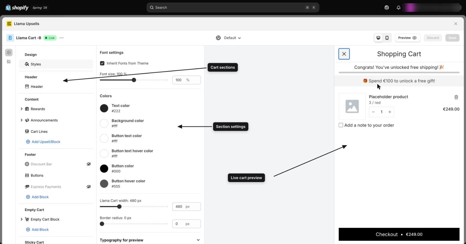
In the Customizer page, open Design > Styles to control the overall look of the cart. From here you can adjust:
- Font settings and text
- Buttons
- Background color
- Cart width
- Border radius for all elements
- Custom styling using CSS
Header section
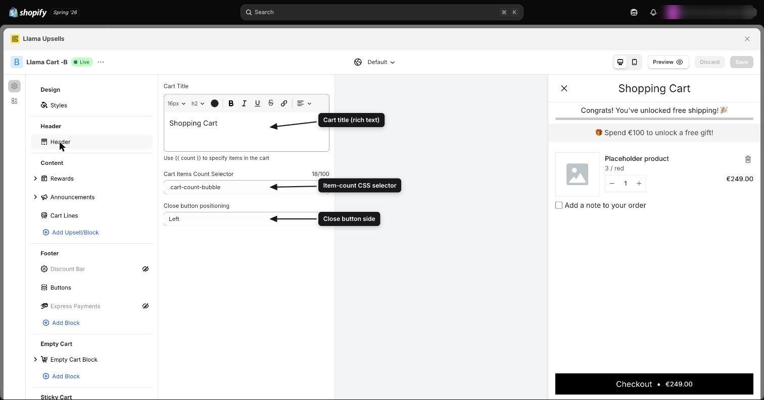
Customize the cart header to fit your store. You can:
- Edit the header title
- Move the close-cart button to the left or right
- Display the cart item count
Rewards and progress bars
Rewards motivate shoppers to add more to their cart to unlock perks like free shipping, free gifts, or a discount once cart value reaches a threshold. You set them up under Content > Rewards, where you can show progress as a bar or a collapsible section, add icons and tooltips, and target the reward to specific customers.
This is a deep feature with its own guide covering progress vs. congratulations text, the dynamic remaining-amount value, currency-specific thresholds, icons, tooltips, and visibility rules.
Announcement messages
Add a rotating message bar to the drawer for special offers, seasonal discounts, shipping cutoffs, and news. You can stack multiple messages, auto-play them, and target each one to specific markets or customer tags.
The full setup — colors, position, autoplay timing, navigation arrows, and per-shopper targeting — lives in its own guide.
Discount codes
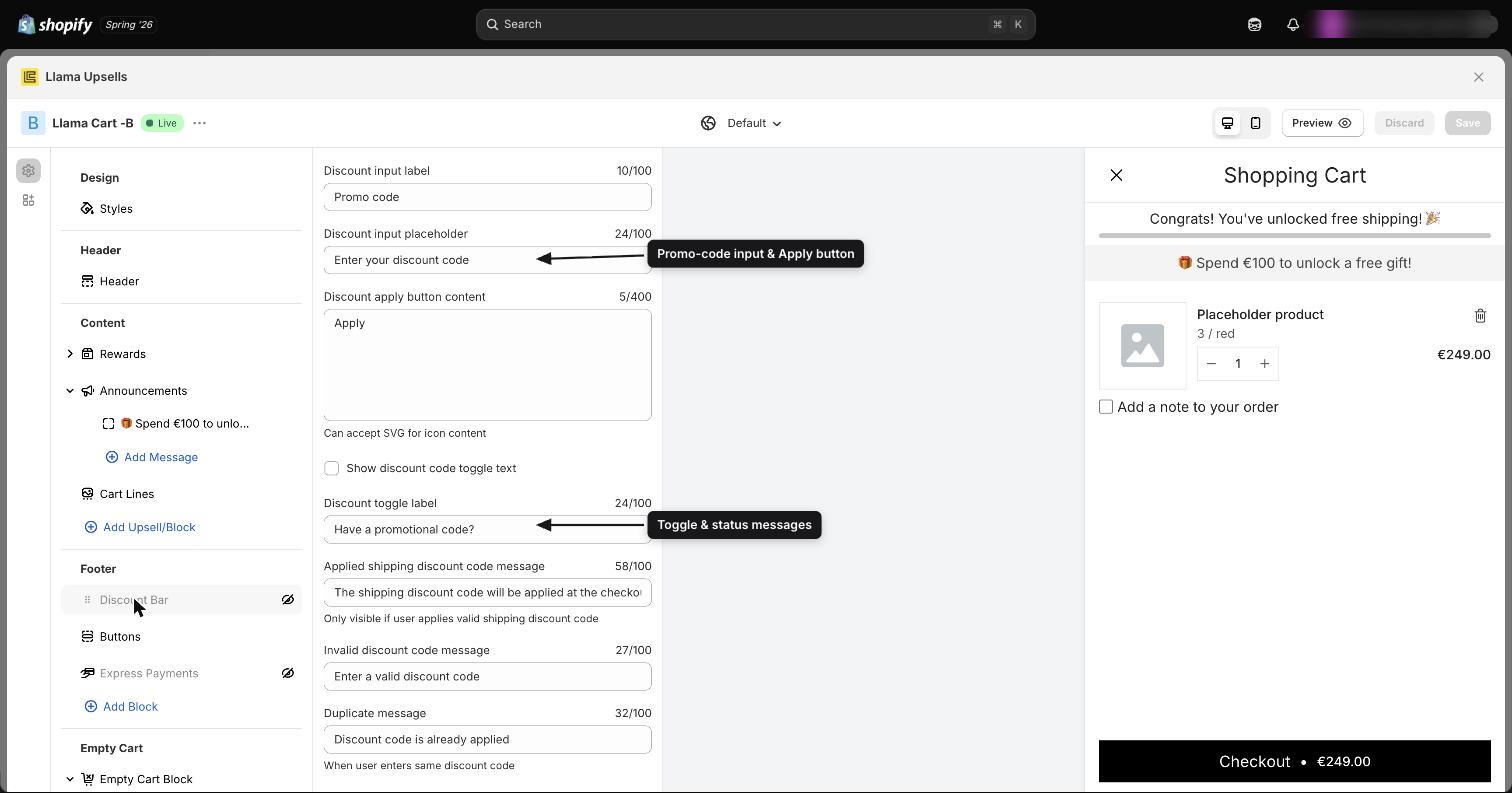
The discount-code field lets customers apply promo codes directly inside the cart, before they reach checkout. You configure it under the Discount codes section of the Customizer. Every label and status message is editable, so you can match your store's voice and translate the copy.
Always-visible vs. toggle mode
By default the discount field is shown inline. On the Classic cart you can instead hide it behind a clickable link, so the drawer stays compact until a shopper actually has a code.
| Setting | What it does | Default |
|---|---|---|
Have a promotional code? toggle (discountCodesToggleEnabled) | When on, the discount field is collapsed behind a link and only expands when the shopper clicks it | Off (field shown inline) |
Toggle label (discountCodesToggleLabel) | The text of that link | Have a promotional code? |
The toggle (and its label) is only available on the Classic cart design. On the Modern cart the discount field is always shown inline — the toggle controls are hidden and have no effect there. If you don't see the toggle option, check which cart version you have selected.
Field labels
| Setting | What it does | Default |
|---|---|---|
Title (discountCodesTitle) | Heading shown above the discount field | Apply discount code |
Placeholder (discountCodesPlaceholder) | Greyed-out hint inside the input | Discount code |
Apply button label (discountCodesLabel) | Text (or icon) on the apply button | Apply |
Prefix content (discountCodesPrefixContent) | Custom HTML or SVG rendered before the input — use it for an icon or a short note | Empty |
The apply button label accepts SVG, so you can replace the word "Apply" with an arrow or tag icon. The prefix content field is an HTML editor — keep it short so it doesn't crowd the input.
Status messages
These messages appear depending on what happens when a shopper applies a code. Each one is editable so you can soften the wording or translate it.
| Setting | When it shows | Default |
|---|---|---|
Invalid code (invalidDiscountCodeMessage) | The code doesn't exist or doesn't apply to the cart | Enter a valid discount code |
Already applied (alreadyAppliedDiscountCodeMessage) | The shopper enters a code that is already on the cart | Discount code is already applied |
Removable at checkout (removableAtCheckoutDiscountCodeMessage) | The code was applied but can only be removed later, on the checkout page | This discount code can be removed in checkout page |
Usage limit reached (limitReachedDiscountCodeMessage) | The code is valid but has hit its usage cap | This discount code has reached its usage limit. |
Shipping discount note (discountCodesShippingMessage) | The shopper applies a valid shipping discount code | The shipping discount code will be applied at the checkout |
Shipping discounts are not reflected in the cart subtotal. When a shopper applies a valid shipping code, the cart shows the shipping note — The shipping discount code will be applied at the checkout — instead of changing the subtotal. The actual saving appears at checkout once a shipping method is chosen. This is expected behavior, not a bug; reassure shoppers by keeping that note clear.
Troubleshooting discount codes
- A valid code shows "Enter a valid discount code." The code usually doesn't apply to the items currently in the cart (for example, a product-specific or minimum-spend discount whose conditions aren't met). Check the code's conditions in your Shopify discounts.
- The discount applied but the subtotal didn't drop. That's expected for shipping discounts — see the warning above. The saving applies at checkout.
- Shoppers can't remove a code. Some codes can only be removed on the checkout page; the removable-at-checkout message explains this. Edit that message if you want clearer wording.
Cart lines
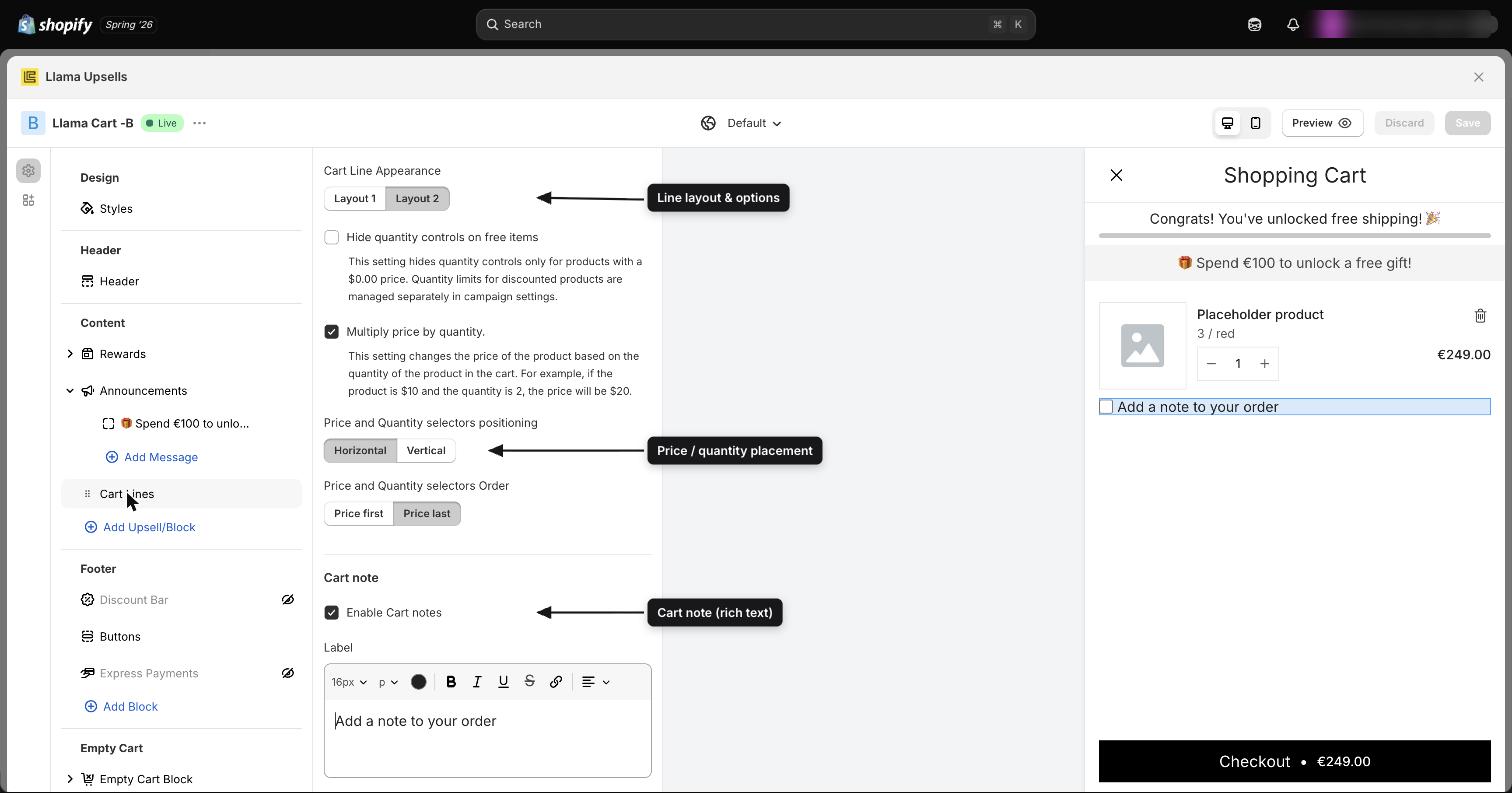
Cart lines control how each item appears in the cart — its layout, where the price and quantity sit, and whether shoppers can leave an order note. You'll find these controls in the Cart lines section of the Customizer, with your added campaigns listed below them.
Item layout
| Setting | Options | Default |
|---|---|---|
Cart item layout (cartItemLayout) | Layout 1 or Layout 2 | Layout 2 |
Item layout is a Classic cart setting. On the Modern cart the line layout is fixed and the Layout 1 / Layout 2 choice is not shown.
Price and quantity placement
These two controls appear only when Layout 2 is selected.
| Setting | Options | Default | Effect |
|---|---|---|---|
Price & quantity layout (priceAndQuantityLayout) | Horizontal or Vertical | Horizontal | Whether the price and quantity stepper sit side by side (horizontal) or stacked (vertical) |
Price & quantity order (priceAndQuantityOrder) | Price first or Price last | Price last | Which element comes first within the layout |
Line item total price
The Show line item total price setting (showLineItemTotalPrice, on by default) multiplies each item's price by its quantity. For example, a $10 product with a quantity of 2 displays as $20 on the line. Turn it off to always show the single-unit price regardless of quantity.
Free items
Hide quantity control for free items (disableQuantityChangeOnFreeItems, off by default) removes the quantity stepper for any product with a $0.00 price — useful for free gifts you don't want shoppers to multiply.
This setting hides the quantity control only for products priced at exactly $0.00. It does not cap quantities for discounted (but non-free) products. Quantity limits for discounted offers are controlled separately in each campaign's settings, not here.
Subscriptions
If a product variant qualifies for a subscription, the cart can show an upgrade button. Two settings control it:
| Setting | What it does | Default |
|---|---|---|
Show subscription button (showEnableSubscriptionBtn) | Displays the upgrade button when the added variant qualifies for a subscription | On |
Button content (enableSubscriptionBtnContent) | The button text | Upgrade to Subscription & Save {{ amount }} |
Use the {{ amount }} placeholder in the button text to insert the actual subscription saving — it is replaced automatically with the real value, so a single message stays accurate for every product.
Cart note
Let shoppers leave a note on their order. The cart note controls are a Classic cart feature.
| Setting | What it does | Default |
|---|---|---|
Enable cart notes (enableCartNote) | Shows the order-note field in the cart | On |
Note label (cartNoteLabel) | The rich-text label above the field | Add order note |
Note placeholder (cartNotePlaceholder) | Hint inside the field | Comment for your order |
Maximum length (cartNoteMaxLength) | Character limit for the note | 250 (configurable from 50 to 10,000) |
Campaign configurations
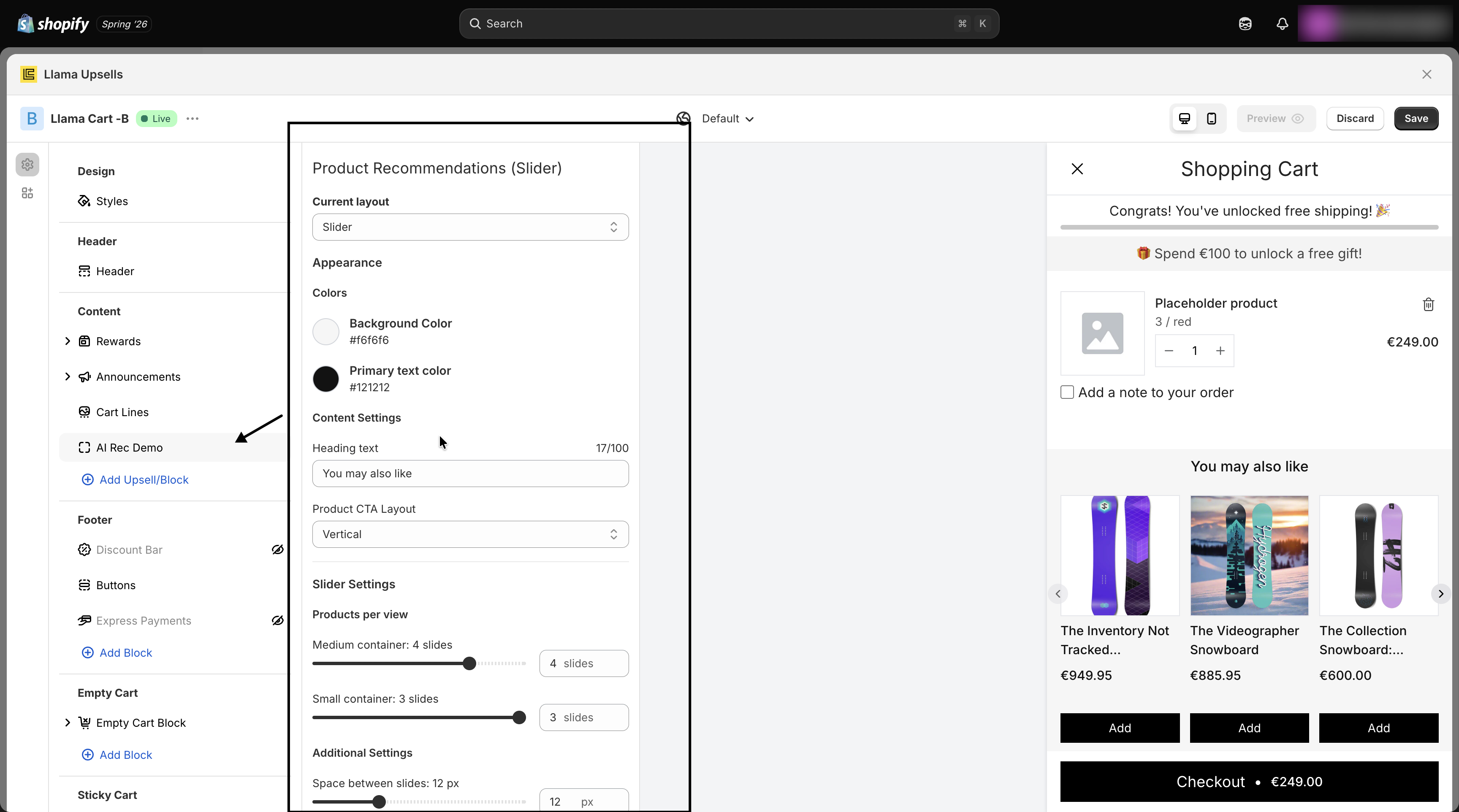
You can add and configure Product Recommendation and Gift with Purchase campaigns right below the Cart lines section.
Layout types
Each campaign offers multiple layout options:
- Slider — a customizable carousel of recommended products
- List — items displayed in a single row
- List slider — a scrollable list for small containers only
Appearance
The Appearance section includes controls for the primary color (button color), secondary color (background color), and primary text color.
Collapsible settings
Enable a collapsible container, and choose whether it is initially open.
Slider settings
The slider shows several products at once. The number visible per view is set independently for each container size, and every size defaults to 3 products per view.
| Container | Setting | Default | Configurable range |
|---|---|---|---|
| Medium / tablet | Products per view (slidesPerViewTablet) | 3 | 1 to 5 (in steps of 0.5) |
| Small / mobile | Products per view (slidesPerViewMobile) | 3 | 1 to 3 (in steps of 0.5) |
Fractional values (like 2.5) are allowed and intentionally show a sliver of the next product, signalling to shoppers that they can swipe for more. There is also a Space between slides control (0 to 40 px) for the gap between products.
Slider controls
Show arrows and bullets for easier slider navigation.
Button text
Customize the button text for its three states: Add, Adding, and Added.
Quick view button
Let shoppers view product details without leaving the cart. The eye icon appears next to the add-product button and can be customized from Settings > Global Style.
Additional settings
- Product click action — Quick view, Open Product Page, or No Action (the default)
- Hide out of stock — out-of-stock products won't appear in the campaign
- Hide added offers — offers already added to the cart are hidden from the campaign
Express payments
Accelerated checkout buttons — PayPal, Apple Pay, Google Pay, Shop Pay, and more — can appear inside the Llama Cart so shoppers skip straight to payment. Enabling them requires a one-time theme snippet plus styling controls in the Customizer.
The full setup, including the required theme.liquid snippet, button styling, and per-provider toggles, is covered in its own guide.
Related guides
Widgets & Llama Cart overview
How storefront widgets and the Llama Cart slide-out drawer display your offers, and what you can customize.
Express payments setup
Add accelerated checkout buttons (PayPal, Apple Pay, Shop Pay, and more) to the Llama Cart, including the required theme snippet and styling controls.