
Widgets & Llama Cart overview
How storefront widgets and the Llama Cart slide-out drawer display your offers, and what you can customize.
The app shows your upsell and cross-sell offers on the storefront in two ways: individual widgets placed on your pages, and the Llama Cart — a fully branded slide-out cart drawer that can hold offer widgets, announcements, reward progress, and more. Both are customized through a visual editor in the app admin, so no theme code is required.
This page is a map of how the storefront experience fits together. Use the cards below to jump to the detailed guides.
Llama Cart features
Everything you can put inside the slide-out cart drawer — campaign blocks, announcements, rewards, and more.
Theme cart type & compatibility
Set your theme to a drawer cart and run the compatibility check so Llama Cart opens reliably.
What's new in the new standard cart
See what's different between the Legacy cart and the New standard cart, side by side.
Versions & customization
Run A/B tests with up to three cart versions and set market-specific overrides.
Customizing appearance
Set colors, fonts, button labels, and layout for your widgets and cart.
AI recommendations
Let the app suggest the products most likely to sell in your widgets.
Storefront widgets
Each campaign type has its own widget format, so the offer always matches where it appears:
| Campaign type | Widget format |
|---|---|
| Product recommendations (pre-purchase) | Horizontal slider, vertical list, or scrollable list |
| Gift with purchase | Slider, list, or list (v2) |
| Auto-add | No visible widget — the product is added silently |
| Checkout upsells | Embedded widget inside the Shopify checkout page |
| Post-purchase | Full-page offer shown after checkout completes |
| Unlock (content unlock) | Threshold-progress widget that reveals an offer when the cart reaches the set amount |
A widget only renders when its campaign's conditions are met. As the cart changes — an item added, removed, or its quantity changed — the widget re-evaluates your conditions instantly, with no page reload.
Where widgets appear
Pre-purchase and gift-with-purchase widgets are placed by adding the app's theme block to any section in your Shopify theme editor, so you control exactly where they show — product pages, the cart page, collection pages, and so on.
Checkout and post-purchase widgets appear in Shopify's native checkout and post-checkout surfaces. You don't need to edit your theme for these.
Every storefront widget renders inside its own isolated container. Your theme's CSS can't accidentally change a widget's appearance, and a widget's styles can't leak into your theme — all styling is self-contained.
Quick View modal
A Quick View modal lets shoppers preview product details before adding to the cart, without navigating away from the page they're on.
Llama Cart
Llama Cart is a slide-out cart drawer that replaces Shopify's default cart. It's the primary place to show your upsell and gift-with-purchase offers inside the cart experience. Llama Cart is optional: you enable it in the theme editor and configure it in the app's cart customizer.
What you can put in the drawer
You decide exactly what appears inside the cart by adding and ordering blocks. Each block type has its own deep guide — follow the links below for the full settings reference, recipes, and edge cases.
- Campaign blocks — attach a pre-purchase or gift-with-purchase campaign to display its offer inline in the cart. The campaign must be active for its block to show content. See Llama Cart features.
- Rewards & progress bars — show the shopper how close they are to a perk like free shipping or a free gift, with milestone tiers, icons, tooltips, and dynamic copy. See Rewards & progress bars.
- Announcement messages — a rotating message bar at the top of the drawer for promos, shipping cutoffs, and news, with per-shopper targeting. See Announcement messages.
- Express payments — accelerated, one-tap checkout buttons (PayPal, Apple Pay, Shop Pay, and more) in the cart footer. See Express payments setup.
- Custom HTML & rich text blocks — drop your own markup or formatted text into the cart body or footer for trust badges, urgency banners, or legal notes. See Custom HTML & rich text blocks.
- Discount code block — a field where shoppers enter discount codes without leaving the cart.
- Empty cart state — control what the drawer shows when the cart is empty: a message, recommended collections, and a clear call to action. See Empty cart state.
- Floating cart icon — a persistent button pinned to a corner of your storefront that opens the drawer and shows a live item count. See Floating cart icon.
Block limits per configuration: up to 20 campaign blocks, up to 10 announcement messages, up to 10 custom HTML blocks, and up to 10 rich text blocks.
Legacy cart vs the new standard cart
The Llama Cart drawer comes in two designs: the Legacy cart (the original look) and the New standard cart (a refreshed layout with its own sliders, list templates, dividers, and icons). New shops start on the New standard cart; shops already on the Legacy cart can switch from the Design tab of the Customizer. The design affects how some blocks render, so it's worth deciding early — and worth knowing what won't come back if you switch away later.
For the side-by-side comparison, see What's new in the new standard cart. To move over safely, see Migrating to the new standard cart.
Set up your theme cart type
For the drawer to open instead of your theme's built-in cart, your theme's cart type has to be a drawer-style cart (not a full cart page), and no other app or custom code can be competing for control of the cart.
If Llama Cart doesn't open on your storefront, the most common cause is a mismatched theme cart type or a conflicting app. Run the built-in 5-point compatibility check and apply the per-failure fixes in Theme cart type & compatibility.
Drawer settings
The cart customizer lets you control the look and behavior of the drawer, including:
- Background color, text color, and button colors
- Border radius, font size, and drawer width
- The cart title — the default is
<h2>Your cart ({{ count }})</h2>, where the{{ count }}placeholder is replaced with the live item count - Checkout and "View Cart" button labels
- Whether to show the discount code input
- Whether to enable a cart note field
- The empty-cart state and which collections to show when the cart is empty
- Express payment buttons (Apple Pay, Google Pay, PayPal, and others)
- A custom font, or inherit your theme's font
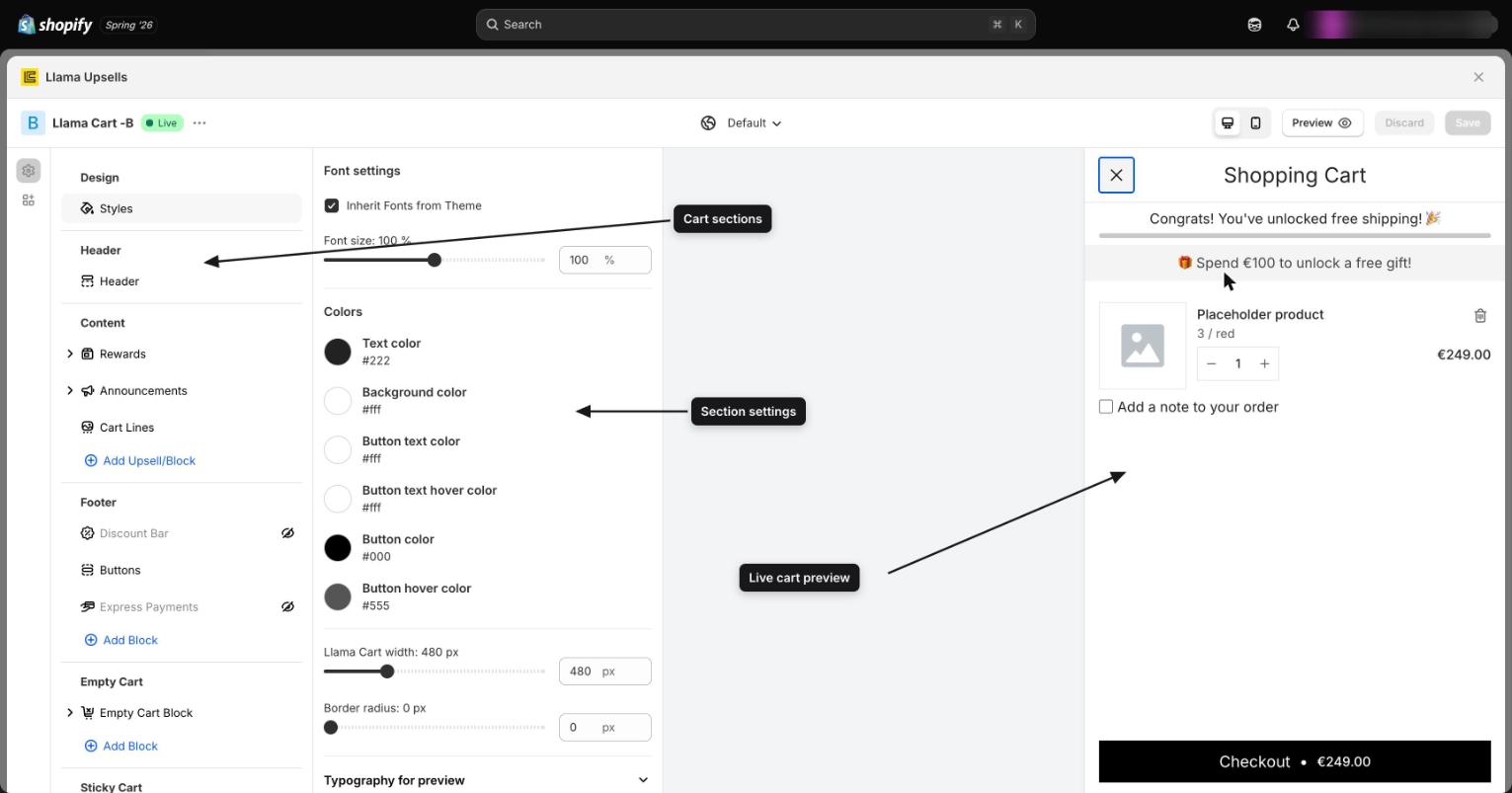
A/B testing and markets
Llama Cart supports up to three independent configurations (versions A, B, and C) so you can A/B test different cart designs. Each version is a complete, separate setup, and only one is live on your storefront at a time. You can build a version from scratch, clone an existing one, rename it, sync settings between versions, publish a version to make it live, or delete any version that isn't active.
Within each version you can also create market-specific overrides — for example, different announcement text or a different color scheme for shoppers in the EU versus the US.
For the full walkthrough, see Versions & customization.
How widgets and Llama Cart work with the rest of the app
- Campaigns are the source content for widgets and Llama Cart blocks. A campaign must be active for its offer to render.
- Discounts are applied automatically at checkout when a shopper adds a product through a widget. The widget itself doesn't show the final checkout price — it shows the configured discount as a badge.
- Cart restrictions run at the checkout level. The drawer doesn't block add-to-cart for a restricted product, but the shopper sees the restriction error when they try to complete checkout.
- Gift with purchase widgets show a progress bar toward the gift threshold, with three message states you configure: while the shopper is making progress, once the threshold is met, and if the cart drops back below the threshold. GWP offers can include Shopify "unlisted" products; turn on Hide unlisted products in the GWP customizer if you'd rather keep them out of the offer.
Where to go next
Restrictions & limiters with discounts, auto-add & gifts
How cart-validation rules collide with offers and discounts — and how to design the two sides so they never block a cart you created.
Llama Cart features
Tour the Llama Cart drawer — styles, rewards, announcements, discount codes, cart lines, campaigns, and express payments — and where to set each.