
What's new in the new standard cart
A side-by-side look at what changed between the Legacy Llama Cart and the New standard cart — the refreshed layout, the pill-and-sheet footer, new color controls, and more.
The Llama Cart drawer has a refreshed design — the New standard cart. It does everything the Legacy cart did — upsell blocks, rewards, announcements, discount codes, express payments — with a cleaner layout, a tidier footer, more color controls, and better accessibility. New shops start on the New standard cart automatically; shops already using the Legacy cart can move over when they're ready.
This page shows what's different, side by side. When you're ready to move, see Migrating to the new standard cart.
Names you'll see in the app. In the Customizer's Design tab, the two designs are labeled Classic (the Legacy cart) and Modern (the New standard cart). This guide says "Legacy" and "New standard"; the buttons and banners in the admin say "Classic" and "Modern."
At a glance
| Legacy cart | New standard cart | |
|---|---|---|
| Overall look | The original design | Refreshed sliders, list templates, dividers, icons, and title size |
| Footer note & discount | Inline in the footer | Pill buttons that open bottom sheets |
| Color controls | Background, text, buttons | Adds Secondary, Accent, Cart footer, and Lines |
| Rewards layout | Progress or Collapsable | Progress only |
| Accessibility | — | Rebuilt to meet WCAG 2.1 AA |
The rest of this page expands on each row with a before/after.
The refreshed drawer
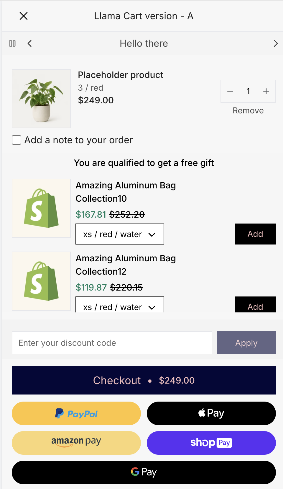
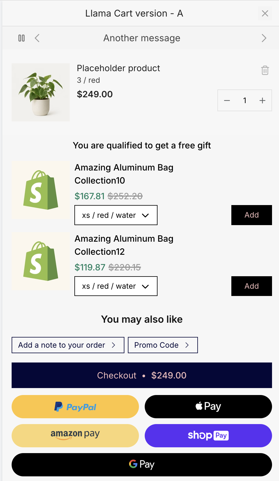
Same cart, refreshed design system — new sliders, list templates, dividers, icons, and a resized title. The clearest everyday difference is the footer: the order note and discount code move out of the always-visible footer, and line items get a tidier layout.
A cleaner footer: pills and sheets
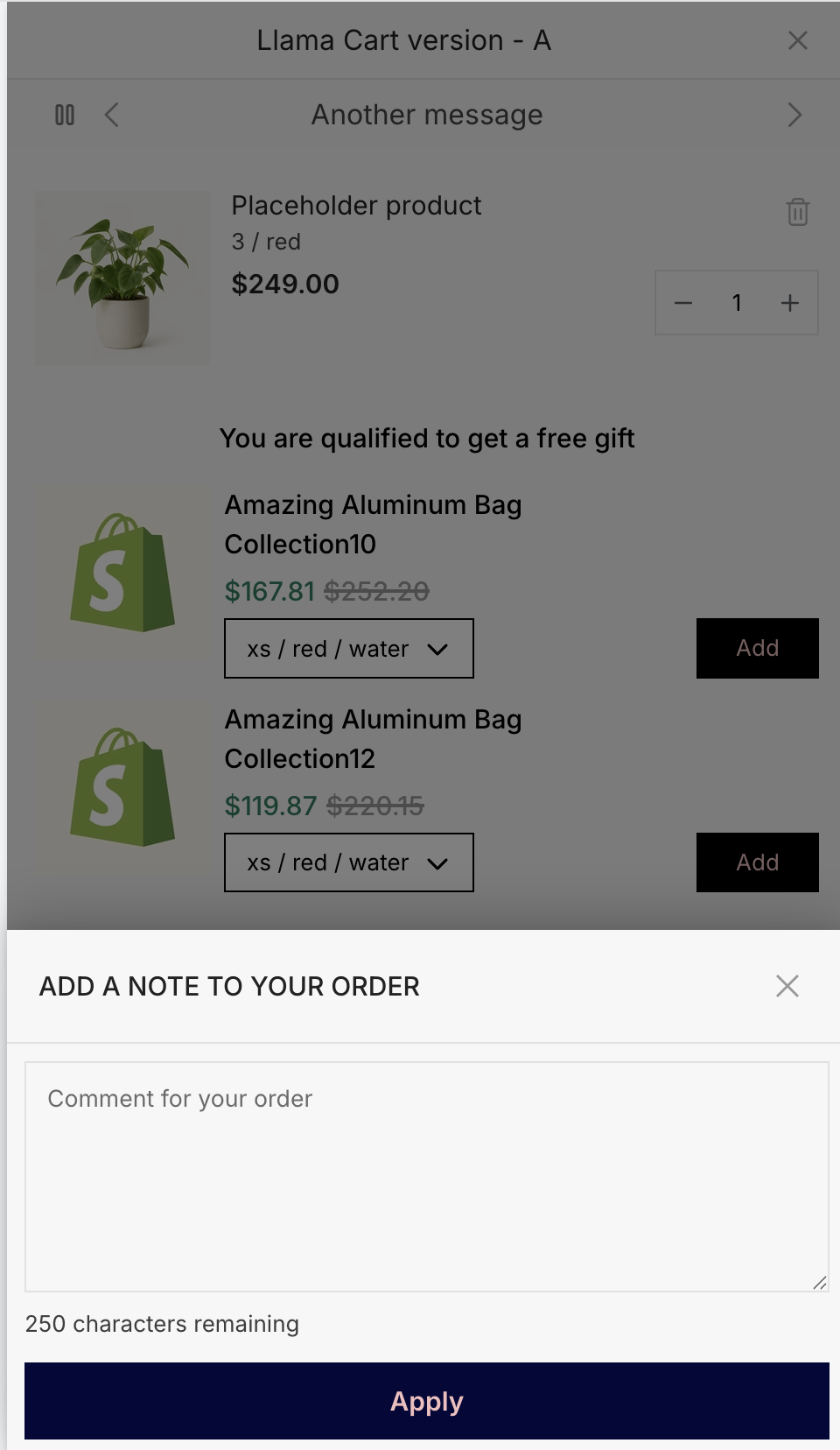
On the New standard cart, the order note and discount code become pill buttons in the footer. Tapping one slides up a bottom sheet with that field, so the footer stays compact and the checkout button stays front and center. (Prefer the old stacked look? You can switch the footer back to inline blocks in the cart's Footer settings.)
Refreshed upsell blocks
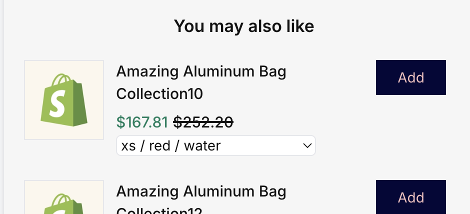
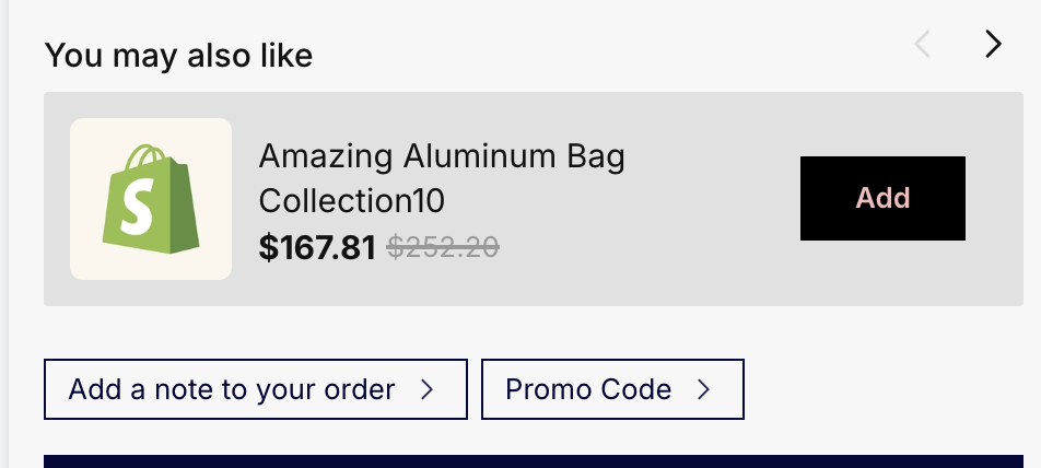
Upsell blocks get the same refresh. Here's the same "You may also like" recommendation block on each design — the New standard cart uses a left-aligned heading with slider arrows and a cleaner card, showing one product at a time.
More color controls
The New standard cart adds four color controls on the Design tab so you can style more of the drawer to match your brand:
| Control | Default | What it colors |
|---|---|---|
| Secondary elements | #999999 | Secondary UI details in the cart |
| Accent elements | #D5EBFF | Accent details |
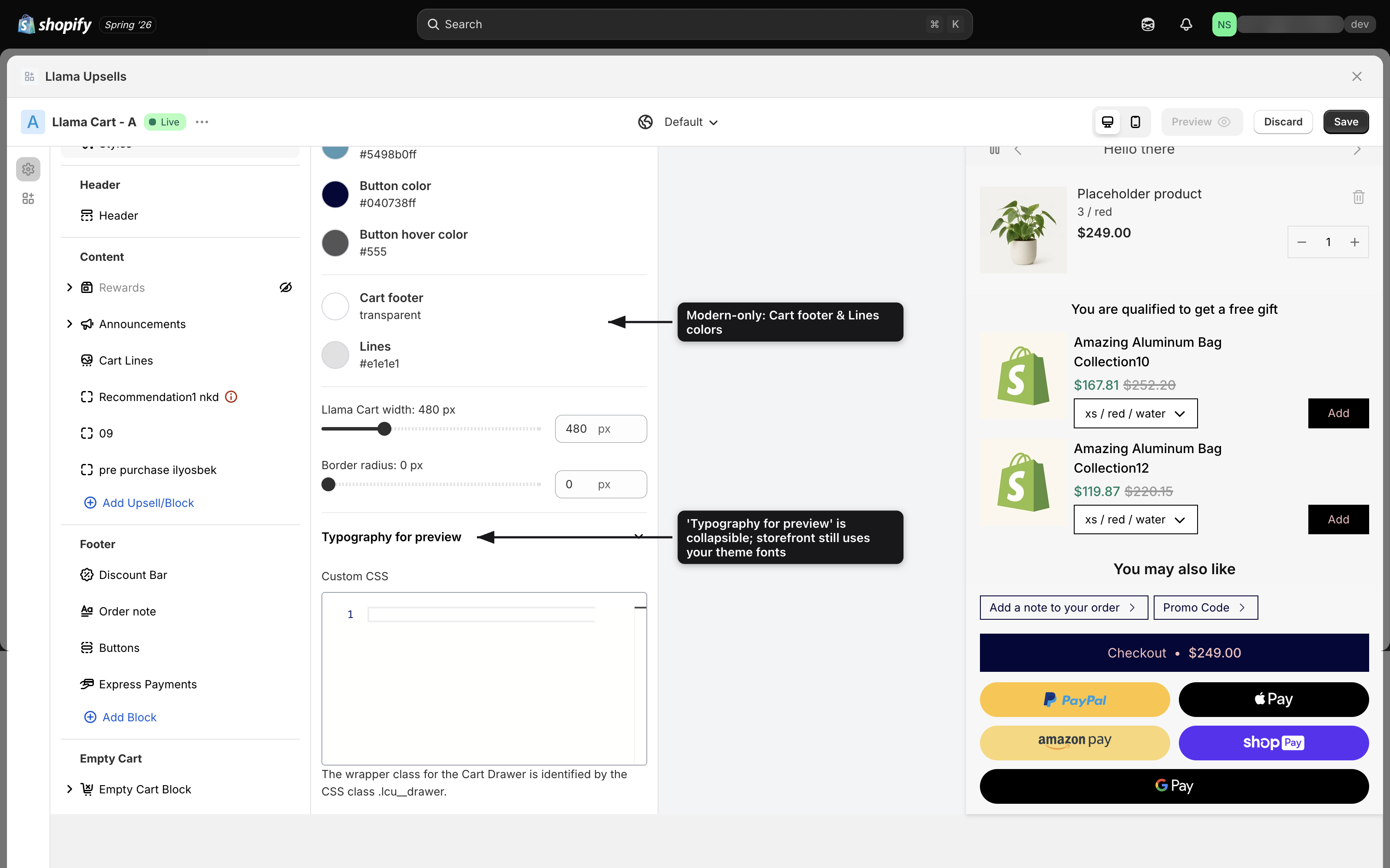
| Cart footer | transparent | The footer background |
| Lines | #e1e1e1 | Dividers and connector lines |
The Design tab also checks your colors against the WCAG AA 4.5:1 contrast minimum and flags any pair that's hard to read — including a Text on footer background check that's unique to the New standard cart (because the Cart footer color is too).
Also new
- Rewards use the Progress layout. On the New standard cart the rewards bar always uses the Progress layout; the Collapsable layout and its background-color picker are hidden. See Rewards & progress bars.
- Tidier bundles. Bundled products group as a parent with their items nested underneath, connected by a small tree line, so shoppers can see what belongs together.
- Built for accessibility. The New standard cart was rebuilt to meet WCAG 2.1 AA — proper headings and reading order, keyboard-navigable controls, and the contrast checks above.
Am I on the new cart?
It depends on how your shop started:
| Your shop | Starting design | Need to switch? |
|---|---|---|
| Brand-new install | New standard cart | No — you're already on it |
| Existing shop with a cart configured | Legacy cart | Optional — a Switch to Modern button appears on the Design tab |
If you don't see a Switch button on the Design tab, that usually means you're already on the New standard cart.
Moving from the Legacy cart to the New standard cart is easy, but a full move-back is lossy — your Custom CSS and footer/order-note layout won't be restored. Read Migrating to the new standard cart before you switch.
Related
Migrating to the new standard cart
A pre-flight checklist, the step-by-step switch, and what won't come back if you revert.
Llama Cart versions & customization
Run A/B/C version tests and style the cart per market.
Rewards & progress bars
Set up the rewards bar, including the Progress layout used on the new cart.
Announcement messages
Add a rotating message bar to your Llama Cart drawer for promos, shipping cutoffs, and news, with per-shopper targeting.
Migrating to the new standard cart
How to move your Llama Cart from the Legacy design to the New standard cart — what to back up first, how to switch, and what won't come back if you revert.