
Customize the Post-Purchase offer page
A complete reference for the Post-Purchase customizer — timer, layout, titles, buttons, and labels, with defaults and edit recipes.
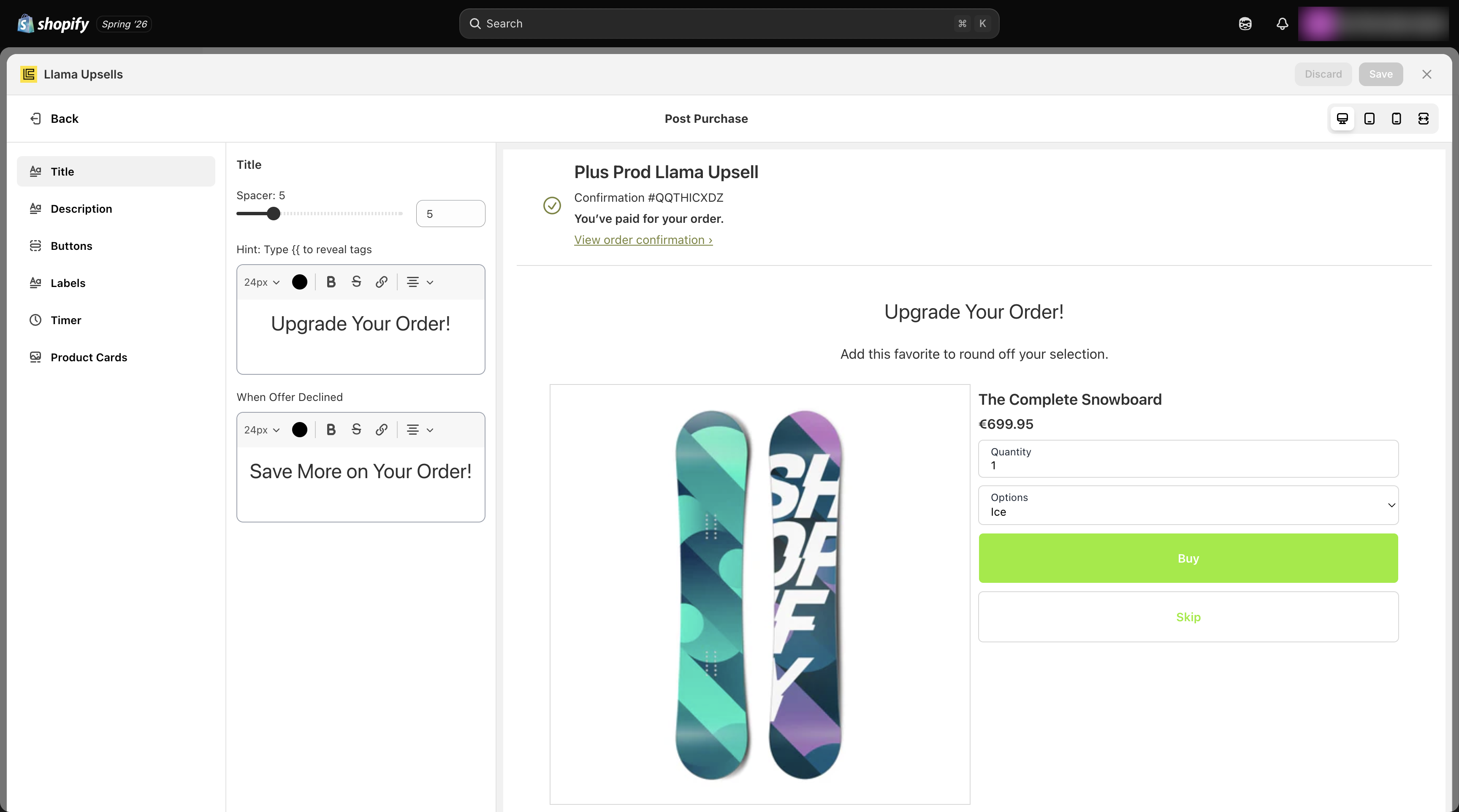
The Post-Purchase customizer controls everything a shopper sees on the offer page that appears right after payment but before the order-confirmation screen. This page is a full reference for every setting in that customizer — what each one does, its exact default value, and the edge cases that catch merchants out. To set up the offer itself (which products, which discount, which conditions), start with the Post-Purchase setup guide. For how offers are ranked and how the downsell fallback fires, see Post-Purchase advanced.
The offer page renders inside an isolated frame (an iframe) that Shopify hosts. Your theme's CSS cannot reach into it, so the only way to change how the page looks is through the settings on this page. That isolation is also why your styling stays consistent no matter which theme you run.
How the customizer is organized
The customizer groups its settings into four areas: Titles & descriptions, Buttons & labels, Layout, and Countdown timer. Every field below maps to one setting on the offer. Defaults are the values a brand-new Post-Purchase campaign ships with, so if you never open the customizer you get exactly the behavior described in the "Default" column.
There are two parallel sets of title and description fields: one pair for the main offer (the first thing a shopper sees) and one pair for the downsell (the fallback shown after a shopper skips the main offer). Everything else — buttons, labels, layout, and the timer — is shared across both views.
Titles & descriptions
These fields control the headline and supporting copy at the top of the offer. The title and description fields are rich-text — you can apply formatting (size, alignment, bold) and they support template tokens (see Template tokens reference).
| Setting | Default | What it does |
|---|---|---|
| Title | Upgrade Your Order! (24px, centered) | The main offer's headline. Rich text; supports {{product_title}}. |
| Downsell title | Save More on Your Order! (24px, centered) | The headline shown on the downsell view after a shopper skips the main offer. Rich text; supports {{product_title}}. |
| Description | Add this favorite to round off your selection. (16px, centered) | Supporting copy under the main title. Rich text; supports {{product_title}}. |
| Downsell description | Get this special deal to complement your order at a discounted price. (16px, centered) | Supporting copy for the downsell view. Rich text; supports {{product_title}}. |
| Title spacer | 5 | The amount of vertical space below the title block. |
| Description spacer | 5 | The amount of vertical space below the description block. |
Use {{product_title}} in any of these fields to drop the offered product's name straight into your copy — for example a title of Add {{product_title}} for 20% off personalizes the headline to whatever variant the shopper is being offered.
Buttons & labels
These settings control the buy button, the skip action, and every small piece of label text on a product card. Button text fields take plain text; there is one label, the discounted-price label, that supports a token.
Buy button
| Setting | Default | What it does |
|---|---|---|
| Buy button text | Buy | The label on the button that accepts the offer. |
| Added button text | Added! | The label shown briefly after the item is successfully added to the order. |
| Adding button text | Loading... | The label shown while the add is being processed. |
| Include price on button | false | When on, appends the offer price to the buy button (for example Buy — $24.00). Off by default. |
Skip action
| Setting | Default | What it does |
|---|---|---|
| Skip button text | Skip | The label on the decline / skip control. |
| Skip button position | bottom | Where the skip control sits — top or bottom of the offer. Default bottom. |
| Skip button plain | false | When on, renders the skip control as plain text instead of a full button. Off by default. |
Inline labels
| Setting | Default | What it does |
|---|---|---|
| OR divider label | OR | The text in the divider between the buy and skip actions. |
| Quantity input label | Quantity | The label above the quantity selector on a product card. |
| Options select label | Options | The label above the variant/options selector on a product card. |
| Discounted price label | (Save {{ percentage }}) | The text shown next to a discounted price. Supports the {{ percentage }} token, which is replaced with the actual discount percentage. |
| Free product label | Free | The text shown in place of a price when the offered product is free. |
| Free shipping label | Shipping | The text shown by the free-shipping indicator (see Layout). |
The {{ percentage }} token in the discounted price label is the only token that label fields accept. With the default (Save {{ percentage }}), a 20% offer renders as (Save 20%). Keep the token in your custom text, or the saving figure disappears.
Layout
Layout settings decide how product cards are arranged and how much of each card is shown. The arrangement automatically adapts to how many products the offer contains.
| Setting | Default | What it does |
|---|---|---|
| Card layout | horizontal | Orientation of a single product card — image and details side by side (horizontal) or stacked (vertical). |
| Products per row | 2 | How many product cards sit in a row when the offer has more than one product. |
| Show thumbnails | true | Whether product images appear on the cards. On by default. |
| Show all thumbnails | false | When on, shows the full image gallery for a product rather than a single thumbnail. Off by default. |
| Hide quantity input | false | When on, removes the quantity selector so the shopper can only take the offered quantity. Off by default. |
| Include free shipping | false | When on, displays a free-shipping indicator on the offer. Off by default. |
Single product vs. multiple products
The offer page picks its layout automatically based on product count:
- One product uses a dedicated single-product layout — a single large card.
Products per rowhas no effect here. - Multiple products use a grid/list controlled by
Products per row. With the default of2, cards line up two across; raise it to fit more per row, lower it to1to stack them.
Products per row only applies when the offer actually contains more than one product. If you set it expecting a tighter grid but your offer only has a single product, you'll see no change — the single-product layout ignores it.
Free shipping on multi-product offers
When Include free shipping is on, a free-shipping indicator appears using the Free shipping label (default Shipping). On multi-product layouts this indicator is shown as part of the offer's shipping treatment for the bundle of products, so shoppers see the free-shipping benefit once for the offer rather than repeated on every card.
Countdown timer
The timer turns the offer into a time-limited deal. It is off by default — you must enable it. When on, it shows a banner counting down, and it changes the offer's behavior when it expires (see the edge case below).
| Setting | Default | What it does |
|---|---|---|
| Enable timer | false | Master switch for the countdown. Off by default. |
| Timer duration | 5 | Countdown length in minutes. The default is a 5-minute window. |
| Hide timer banner | false | When on, hides the visible banner while the timer still runs underneath. Off by default. |
| Timer text | Offer ends in {{timer}} (18px, centered) | Rich-text banner copy. Use the {{timer}} token where the live countdown should appear. |
| Timer color | warning | Banner color theme — warning, info, success, or critical. Default warning. |
How the timer behaves at runtime
Once enabled, the timer behaves like this:
Timer durationis set in minutes, but the banner counts down in seconds, displayed asMM:SS(so a duration of5starts at05:00).- The current countdown value is persisted as the page runs, so it keeps ticking down consistently across the whole offer page rather than resetting.
- The
{{timer}}token in your timer text is replaced live with the currentMM:SSvalue on every tick.
When the timer reaches 00:00, the offer page automatically closes (finishes) and the buy buttons are disabled. A shopper who runs out the clock can no longer accept the offer — the page moves on to the order-confirmation screen. Because the page closes itself at zero, set a duration generous enough for a shopper to read the offer, weigh it, and act. A too-short timer (for example one minute) can slam the window shut before a hesitant shopper finishes deciding. The default 5 minutes is a safe starting point; only go shorter if you genuinely want hard urgency and accept that some shoppers will be timed out.
Template tokens reference
Three tokens are available, and each is valid only in specific fields. Using a token in a field that doesn't support it leaves the raw text in place.
| Token | Replaced with | Valid in |
|---|---|---|
{{timer}} | The live countdown value, formatted MM:SS | Timer text |
{{product_title}} | The offered product's title | Title, Downsell title, Description, Downsell description |
{{ percentage }} | The offer's discount percentage | Discounted price label |
Edit example recipes
A punchy, time-pressured deal that closes fast.
Turn the timer on
In the Countdown timer group, switch Enable timer on.
Set a 3-minute window
Set Timer duration to 3. The banner will start at 03:00 and count down in seconds.
Make the banner urgent
Set Timer color to critical so the banner reads as time-sensitive, and keep Timer text as Offer ends in {{timer}} (or rewrite it, keeping the {{timer}} token).
Reinforce on the button
Turn on Include price on button so the price is visible at the moment of decision, and leave Hide timer banner off so the countdown stays in view.
At 00:00 the page closes and the buy button is disabled. Three minutes is deliberately tight — only use it when you want hard urgency and accept that slower shoppers will be timed out.
A relaxed offer with no countdown pressure.
Leave the timer off
In Countdown timer, keep Enable timer off (its default). With no timer, the page never auto-closes — the shopper accepts or skips on their own time.
Soften the copy
In Titles & descriptions, set a welcoming Title such as One more thing for {{product_title}} and a reassuring Description.
Make skipping easy
In Buttons & labels, set Skip button plain on so declining feels low-pressure, and leave Skip button position at bottom.
Two product cards laid out next to each other.
Build a two-product offer
In the offer setup, include two products. With more than one product, the page switches to the grid/list layout automatically.
Set two per row
In Layout, set Products per row to 2 so the two cards sit side by side.
Pick a card orientation
Set Card layout to vertical so each card stacks its image above its details — usually cleaner when two cards share a row. Keep Show thumbnails on so each product shows its image.
Products per row only takes effect with multiple products. A single-product offer always uses the single-product layout and ignores this setting.
Troubleshooting
Next steps
Running multiple campaigns on the same product or page
How several different campaigns interact when their conditions overlap on the same cart, product, or page — what stacks, what wins, and what to watch for.
Post-Purchase advanced - priority, downsell & timer
How the app decides which Post-Purchase campaign wins by priority, how the downsell fallback fires when a customer declines, and how the countdown timer behaves.